
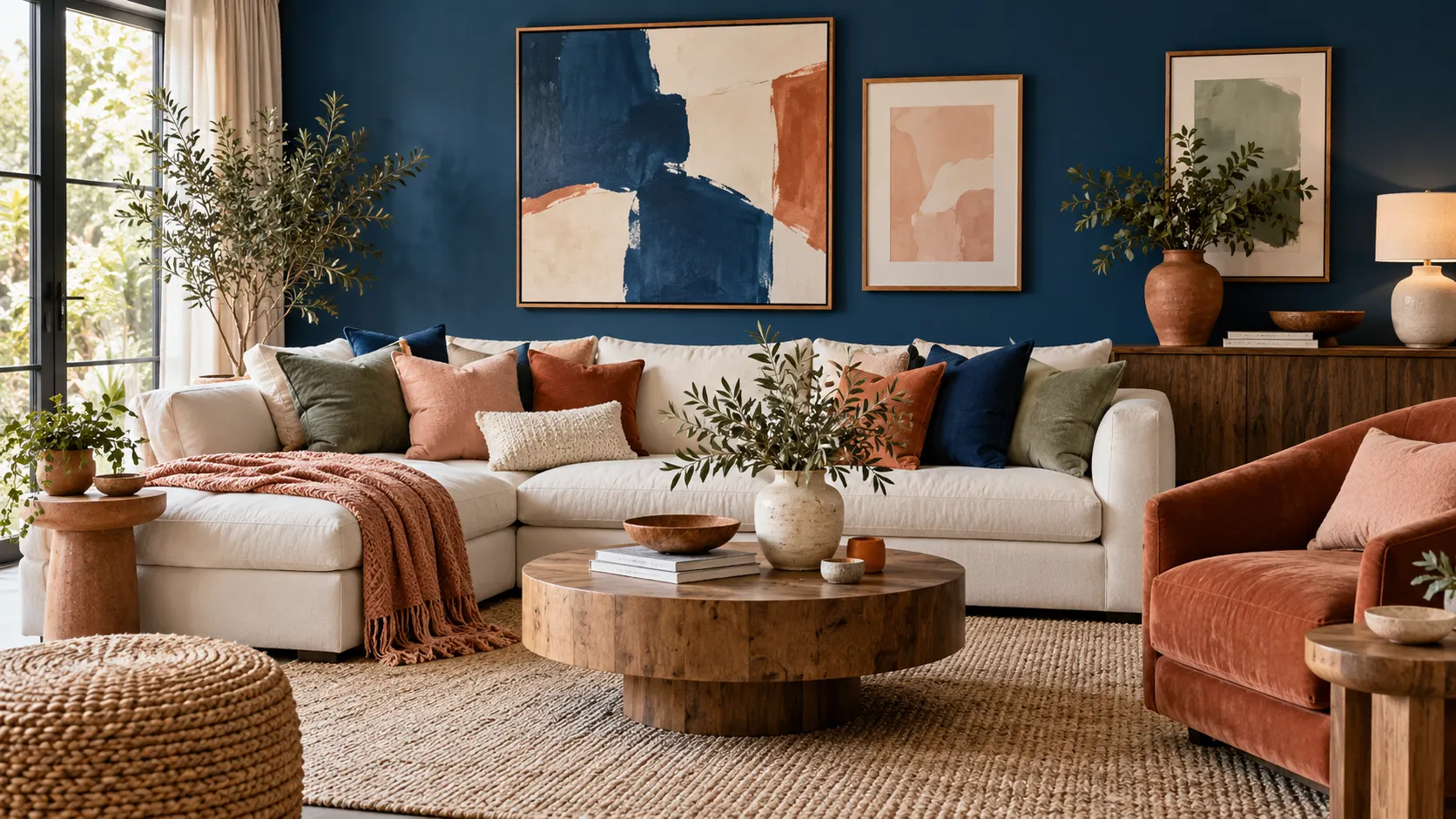
What Colors Go with Blue?
Blue pairs well with many colors because it ranges from soft, airy shades to deep, dramatic tones. White and cream create a fresh look, while warm colors such as terracotta and mustard add contrast. Green, pink, gray, and natural wood can also complement blue, depending on the shade and mood you want.
Start by identifying the blue’s undertone. A cool blue with hints of violet or gray often works with crisp white, charcoal, and cool green. A warmer blue that leans toward teal can sit comfortably beside earthy colors, warm neutrals, and golden accents.
Think about where the color will appear and how much of it you plan to use. Blue can cover walls, anchor a sofa, or show up in small details such as cushions and artwork. The right pairing depends on the room’s lighting, existing finishes, and the balance between bold and restful colors.
Pair Blue with White for a Fresh, Classic Look
White is one of the simplest colors to pair with blue. Together, they create a clean, bright combination that suits coastal, traditional, and contemporary interiors. Try navy with crisp white for strong contrast, or combine pale blue with soft white for a lighter, more relaxed effect.
Use white to balance blue walls, a blue sofa, or patterned blue bedding. White trim can define a room with darker blue paint, while white curtains and upholstery keep the space from feeling too heavy. If the room receives little natural light, a warm white may feel more welcoming than a stark, cool shade.
The finish and texture of white also matter. Linen, painted wood, ceramic, and cotton add subtle variation without introducing another strong color. Repeating white in several places, such as on trim, lampshades, and cushions, helps the blue-and-white palette feel intentional.
Choose Cream and Beige for a Softer Palette
Cream and beige warm up blue without taking away its calming quality. These neutral shades work especially well with slate, denim, teal, and navy. A blue feature wall paired with beige furnishings can feel welcoming and grounded, while cream details keep a pale blue room from looking too cool.
Natural textures make this combination more interesting. Add a jute rug, a linen sofa, woven baskets, or light wood furniture to bring warmth to a blue-and-beige living room. These materials create visual depth, even when the overall color palette stays simple and restrained.
Pay attention to undertones when choosing beige or cream. A yellow-based cream can complement a warm teal, while a pinkish beige may sit more naturally beside certain muted blues. Test paint or fabric samples together in the room, since daylight and artificial lighting can shift how the colors appear.
Add Gray for a Calm, Contemporary Feel
Gray and blue are both versatile, so they can form a polished color scheme without much effort. Pale blue with light gray feels airy and understated, while navy with charcoal creates a moodier, more dramatic setting. This pairing often suits bedrooms, offices, and modern living spaces.
To prevent blue and gray from feeling flat, vary their depth and texture. Combine smooth painted walls with a wool rug, upholstered furniture, or textured cushions. A lighter gray wall can also give a navy sofa room to stand out without the sharper contrast of bright white.
Warm accents can make a cool blue-and-gray room feel more inviting. Add natural wood, brass, or a cream throw to soften the palette. If the room has limited sunlight, choose a warmer gray or introduce a brighter shade in smaller details.
Use Green to Create a Natural Color Combination
Blue and green are neighbors on the color wheel, which makes them easy to combine. Pale blue with sage green feels gentle and restful, while navy with emerald creates a richer, more saturated look. Teal naturally bridges the two colors and can give a room a cohesive, layered appearance.
Bring green into a blue room through plants, artwork, upholstery, or painted cabinetry. A few leafy plants can add life to a blue-and-white living room, while sage cushions can soften a blue bedroom. You can also use different shades of green together, provided one color remains the main accent.
Nature-inspired materials help this palette feel balanced. Wood, stone, rattan, and linen connect blue and green with an organic look. If both colors are strong, keep larger surfaces more neutral and use the bolder shades in smaller areas.
Combine Blue with Yellow or Mustard
Yellow creates lively contrast with blue, bringing warmth and energy into a room. Pale blue and soft yellow can feel cheerful without becoming too bright, while navy and mustard offer a more grounded, sophisticated combination. The difference in temperature helps each color stand out.
Use yellow as an accent if you want the room to stay mostly calm. Cushions, a table lamp, a patterned rug, or a piece of artwork can introduce color without overwhelming blue walls or furniture. For a stronger look, consider mustard upholstery or a painted side table against a navy backdrop.
Balance the two colors by considering their intensity. Bright yellow can dominate a room if used on several large surfaces, while muted mustard tends to feel more relaxed. Add white, beige, or wood tones to give the palette a visual resting place.
Try Coral and Orange for Warm Contrast
Coral, rust, and orange bring warmth to blue and create a more energetic contrast than neutral pairings. Burnt orange looks striking beside navy, while soft coral can add a playful note to powder blue or denim. These shades can make a cool room feel more welcoming.
You do not need to use orange on a large surface to make the combination work. Introduce it through cushions, a throw, a vase, a rug pattern, or framed art. A few warm accents can draw attention to a blue sofa or bring character to a neutral room.
Choose the shade to suit the room’s mood. Terracotta and rust feel earthy and relaxed, while bright orange or coral can appear more contemporary. If the blue is already vivid, select a muted orange so the two colors complement each other instead of competing.
Pair Blue with Pink or Purple
Pink can soften blue and add a romantic, playful, or modern touch. Dusty rose with navy feels refined, while blush pink and pale blue create a gentle bedroom palette. Brighter pink can work in a bold interior when balanced with simple furniture and neutral surfaces.
Purple offers another option, particularly beside blue shades with similar undertones. Lavender and light blue feel airy, while deep plum can add richness to navy or indigo. If you are mixing blue and purple, use a clear difference in depth or saturation so the colors do not blur together.
Use pink and purple thoughtfully if the room already has several colors. Choose one as the supporting accent and repeat it in a few places, such as in a rug and artwork. Cream, white, or pale gray can help settle the palette and keep it from feeling overly sweet or dramatic.
Add Wood and Metallic Finishes
Wood is a natural partner for blue because its warm tones soften the coolness of the color. Light oak gives pale blue rooms a fresh, casual feel, while walnut adds depth beside navy or ink blue. Wood floors, cabinets, coffee tables, and frames can all bring warmth into a blue palette.
Metallic finishes can make blue feel more polished. Brass and gold add warmth, especially beside navy, teal, or dark blue-green. Chrome and silver suit cooler blues and contemporary interiors, while black metal can create a graphic, modern contrast.
Try not to introduce every finish at once. Pick one or two materials that work with the room’s style, then repeat them for a cohesive look. For instance, brass lighting and a wood coffee table can warm a blue living room without adding another competing color.
Layer Different Shades of Blue
Using multiple blues can create a cohesive room without relying on strong contrasting colors. Pair pale blue walls with denim cushions, or layer navy upholstery with a mid-tone blue rug. Differences in shade, texture, and pattern help the colors feel related rather than repetitive.
Vary the materials as well as the tones. A matte painted wall, velvet chair, cotton curtains, and patterned ceramic can each show blue differently. This adds dimension to a monochromatic color scheme, even if the palette stays within a narrow range.
Use a lighter or neutral color to break up larger blocks of blue. White trim, cream bedding, or a natural wood surface can prevent a blue room from feeling enclosed. If the room is small, keep the darkest blue on one feature or in accents rather than covering every surface.
Choose Blue Color Pairings by Room
In a bedroom, blue often works well with soft white, cream, sage, or muted pink. These colors can support a restful atmosphere without making the space feel plain. Layer bedding, curtains, and rugs in related shades, then use one or two accents to add personality.
For a living room, consider how blue interacts with larger pieces of furniture and the amount of natural light. Navy can ground a room when balanced with light walls, wood, or cream upholstery. Teal or denim blue can feel more relaxed alongside green plants, terracotta, or woven textures.
Kitchens and bathrooms can handle crisp combinations such as blue cabinetry with white tile or pale blue walls with warm brass. In a home office, blue with gray or wood may feel focused and composed. Test samples in each room because lighting, flooring, and nearby finishes influence the final effect.
Use Color Proportion to Keep the Room Balanced
Even a beautiful color combination can feel uncomfortable if every shade has equal visual weight. A simple approach is to make blue the main color, use a supporting neutral, and add one accent shade. This gives the eye a clear focal point while keeping the palette varied.
Consider how much space each color occupies. Blue walls might be balanced by cream furniture and small mustard accents, while a blue sofa could work with neutral walls and a few coral cushions. Patterns can include several colors, but repeat their shades elsewhere to make the arrangement feel connected.
Before committing, gather paint chips, fabric swatches, and photos of the room’s existing features. View them together in morning and evening light, and move the samples around the space. Small tests are useful because a color that looks balanced on a screen may feel very different on a full wall.
Common Mistakes When Pairing Colors with Blue
One mistake is choosing a complementary color without checking its undertone. A warm cream may look yellow beside an icy blue, while a cool gray can seem dull next to a saturated teal. Compare samples side by side instead of relying only on their names or online photos.
Another is adding too many bold shades at once. Blue, yellow, coral, and green can work together, but each needs a clear role in the design. Choose one dominant color, one supporting shade, and perhaps one smaller accent, then use neutral surfaces to keep the room visually comfortable.
It is also easy to overlook lighting and existing materials. Wood floors, stone counters, and warm bulbs can change how blue appears. Test colors in the actual room, and view them at different times of day before painting or buying large pieces of furniture.
Conclusion
Blue works with a wide range of colors, from crisp white and warm beige to green, yellow, coral, pink, and wood. The best pairing depends on the blue’s undertone, the room’s lighting, and the atmosphere you want to create. Start with one main shade and build the palette around it.
Use texture, contrast, and color proportion to keep the design balanced. A neutral can soften a bold combination, while metallic details or natural materials add depth. Test paint and fabric samples in the room before making larger changes.
Whether you are decorating a bedroom, living room, kitchen, or office, blue can be both a calm foundation and a striking accent. Pair it with colors that suit your space and personal style, then repeat those shades thoughtfully. A cohesive palette can make the room feel polished without looking overly coordinated.
FAQs
What is the best color to pair with blue?
White is a versatile choice because it creates a fresh contrast with most blues. Cream, beige, gray, green, and warm accent colors can also work, depending on the shade and room style.
Does blue go with gray?
Yes. Blue and gray create a calm, contemporary palette. Mix light and dark shades or add wood, cream, or brass details to bring warmth and texture to the room.
What warm colors go well with blue?
Mustard, yellow, coral, terracotta, rust, and orange can add warmth to blue. Use them in accents or choose muted versions if you want a softer, more balanced look.
What color goes with navy blue in a living room?
Navy pairs well with white, cream, warm wood, brass, blush pink, and mustard. Use lighter colors to balance navy furniture or walls and keep the living room from feeling too dark.
Can I decorate a room using different shades of blue?
Yes. Layering pale, medium, and dark blue creates depth while keeping the palette cohesive. Add contrasting textures and a neutral shade to break up large areas of blue.